This article explains how to select a date range and compare data from 2 time periods.
TSelect a date range
Instructions:
- Click the date range filter in your screen's upper left corner.
- Select the dates you'd like to measure in the calendar for a custom date range or select a preset date range.
- Click done.
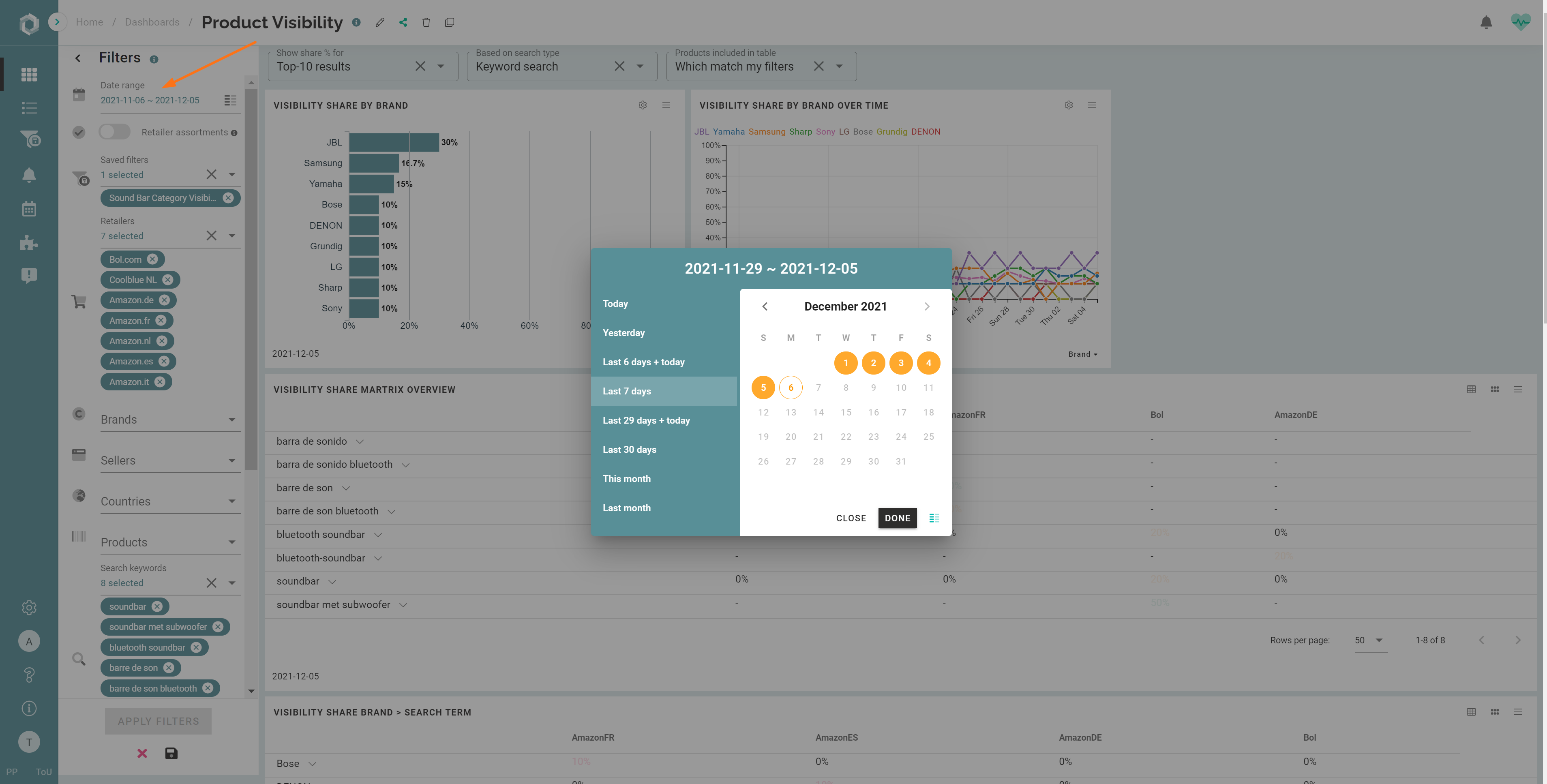
- Click Apply filters.
TIP: To set a default date range on a dashboard, check out this article: how to set a default date range on a dashboard.
Compare data from 2 time periods
Curious whether your in-stock rate improved since your supply chain team uses out-of-stock alerts? Or do you want to quickly compare this month's visibility share to the previous month? SiteLucent provides a way to compare date ranges in KPI-, line- and bar chart widgets.
Instructions:
- Click the date range filter in your screen's upper left corner.
- Click the date comparison icon
 on the filter menu OR the bottom right of the date selection window.
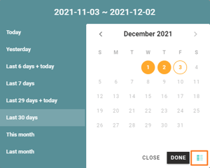
- Select the dates you'd like to compare in the calendar for a custom date range or a preset date range. Do this both on the calendar on the left and on the right.
Custom date ranges (examples):
- Example 1: Select random days by clicking the start and end dates in both calendars (we recommend comparing 2 periods with an equal length).
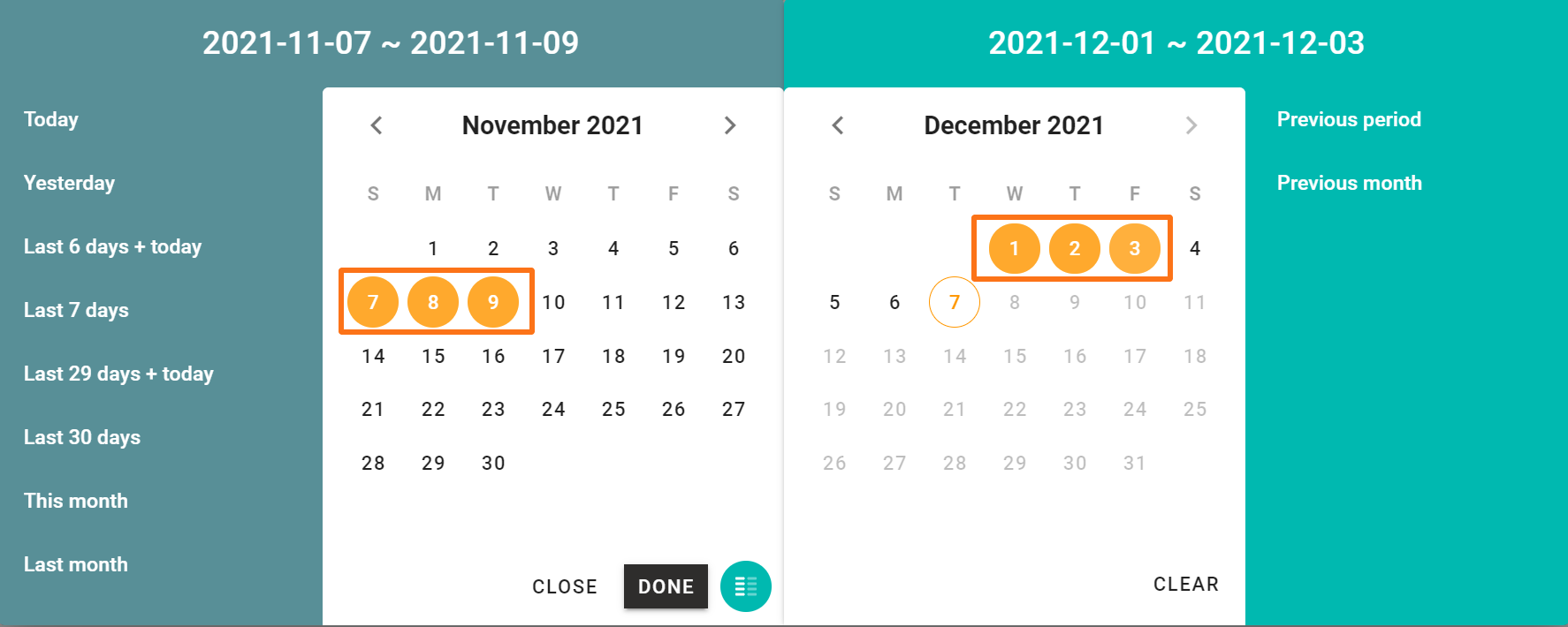
- Example 2: Select 5 random days on the left calendar, combined with 'previous period' on the right calendar. This way, you compare the selected 5 days with the 5 days before that period.
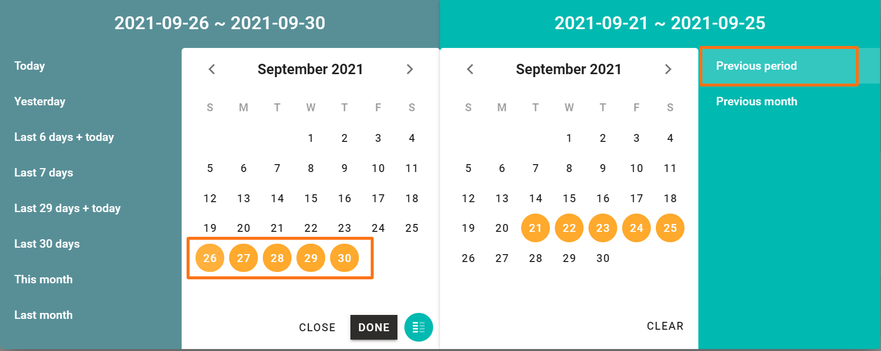
Preset date ranges (examples):
-
Example 1: Select one of the preset date ranges in the left calendar and compare it with the same period a month ago. E.g. compare the last 7 days with the same period a month ago.
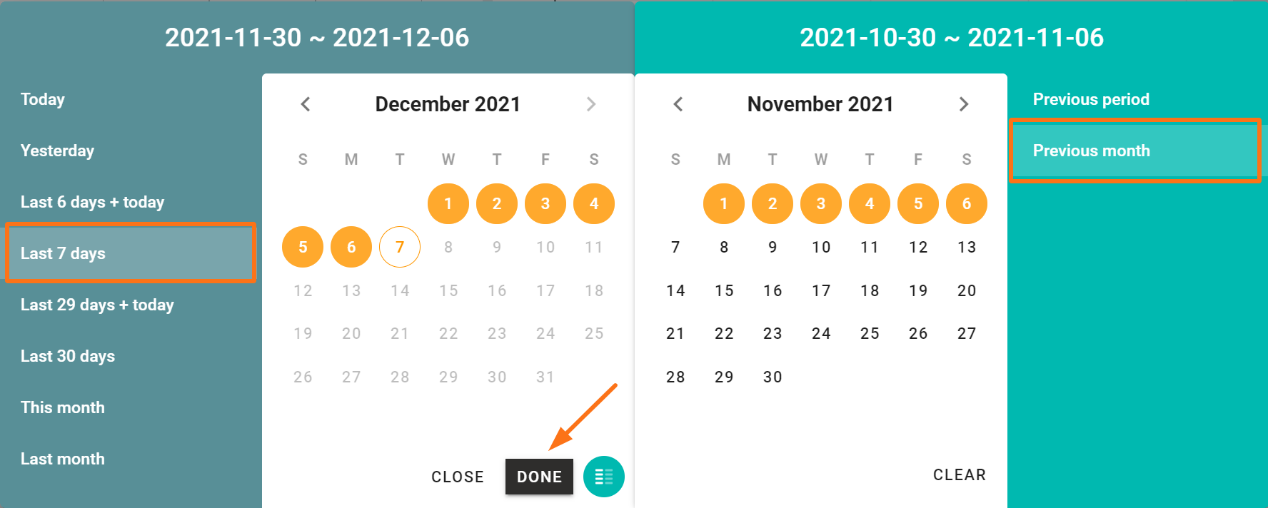
- Example 2: Select the last 7 days on the left calendar, and select 'previous period' on the right calendar, to compare it with the previous 7 days.
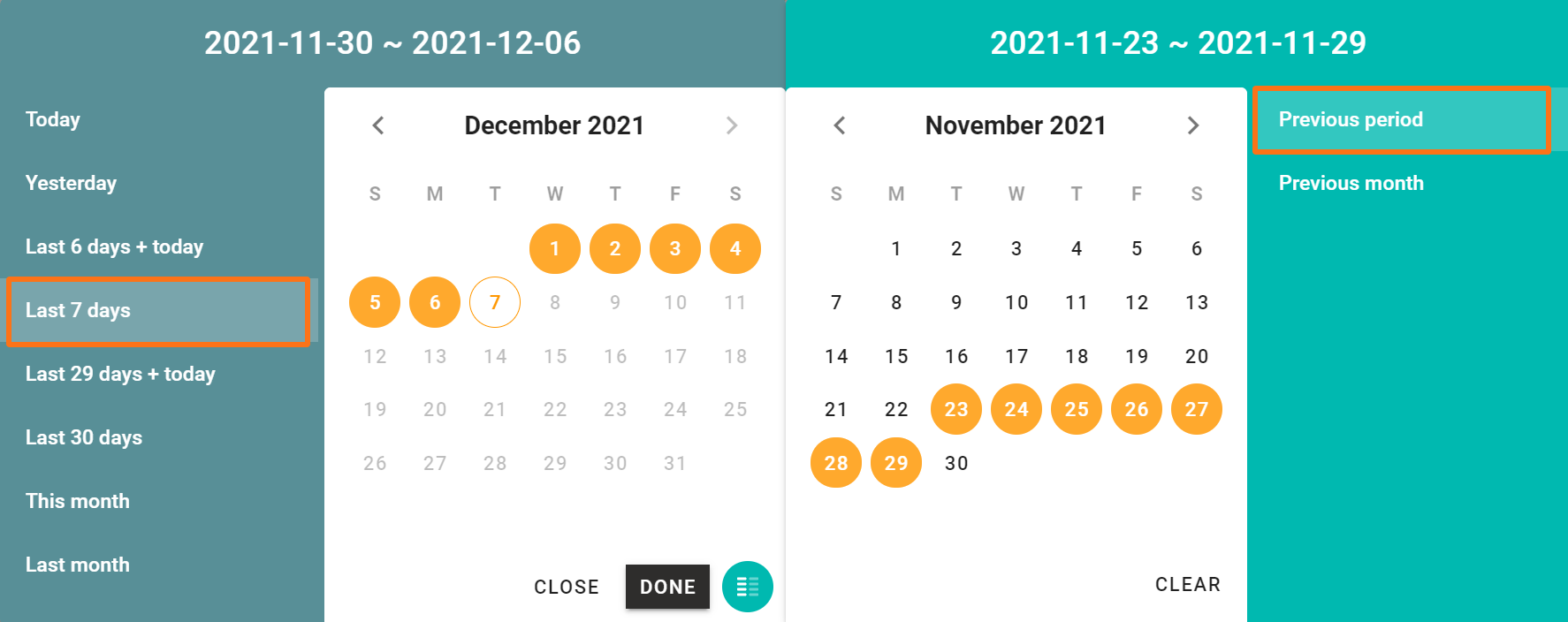
- Click Done.
- Click Apply filters.
Compare data in a dashboard
You'll now see results for both dates ranges in a bar chart and the delta (difference between date A and B) in percentage points (pp) in a line chart.
NOTE: A table widget cannot display the date comparison. In this case, you'll see 'Date comparison not applied' in the upper right corner of the widget.
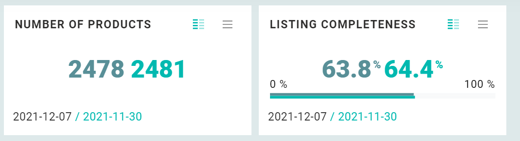
KPI widgets
In a KPI widget, you can see the most recent value of your selected date range on the left (dark green), compared to the value on the last day of your comparison period on the right (bright green).
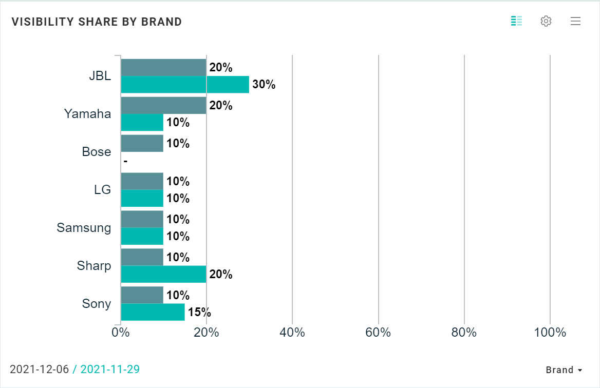
Bar charts
In the bar chart below, the dark green represents the last day of the first date range (2021-12-06), and the bright green represents the last day of the second date range (2021-11-29).
Line charts
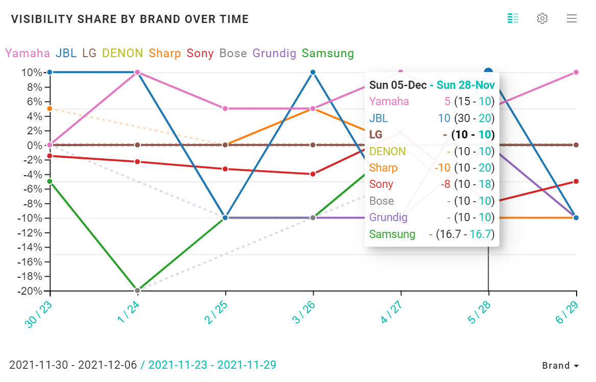
Each line represents the delta between date A and B in percentage points (pp).
Hover over a line or bar chart to see the comparison per date (and per retailer/brand/country etc.). The represented dates are displayed on the pop-up on hover. In the example below, we compare the visibility shares on Sunday, December 5, and November 28.
For instance, looking at Yamaha, the brand had a visibility share of 15% on December 5 and 10% on November 28. It improved by 5 percentage points.
JBL improved by 10 %points, and LG's visibility share remained the same. Sony lost 8 pp.
Performance overviews
Performance overviews give you an overview of your main KPIs in one glance. The conditional coloring in combination with the dashboard clickthrough makes it possible to get aware of, and if needed, quickly deep-dive into underperforming products.
Comparing date ranges shows you how your products are evolving. The example below shows an increase of the product availability of 6,3 percentage points.
TIP: Hover over the red and green differences to see the data from the previous date range.
.png?width=688&name=LinkedIn%20August%20(23).png)